Blocks
Blocks are the pieces inside a section. Click Add block inside a section to see the blocks it accepts. Sections that take general content (Hero, Fabric strip, Featured collection, Image with text, Rich text, Showroom, Video, Newsletter, Contact form, the drawing sections and Product) accept the content blocks below, Custom Liquid and app blocks. Blocks that only make sense in one section, such as Hotspot, Piece or Detail row, are described with their section on the sections page.
Content blocks #
Heading #
| Setting | What it does |
|---|---|
| Heading | Line breaks are kept. [fabric_total] shows the number of fabrics in your library; [fabric_count] shows it rounded down to the nearest ten. |
| Size | Display, Extra large, Large, Medium, Small or Extra small. |
| Heading level | H1, H2, H3 or Paragraph. For screen readers and search engines. Use one H1 per page. On the home page the logo is the H1 unless a heading here is set to H1. |
| Maximum width | 8 to 60 characters per line. |
Text #
| Setting | What it does |
|---|---|
| Text | Rich text. [space_wall] reads "Add your wall to see what fits." until the shopper saves a wall, then "Drawn against your 245 cm wall." |
| Size | Small, Regular, Large or Lead (larger text in the heading font). |
| Use muted text color | Uses the scheme's Muted text color. |
| Maximum width | 20 to 90 characters per line. |
Button #
| Setting | What it does |
|---|---|
| Button label | The button text. |
| Link | Where it goes. |
| Style | Primary, Outline or Text link. |
Two buttons in a row sit side by side. In the Showroom and Contact sections, buttons after the locations start a new row.
A button without a link shows only in the theme editor, with a note. The live store leaves it out, so shoppers never see a button that goes nowhere.
Group #
Holds other blocks, so you can lay them out together. Add it as Column (blocks stacked) or Row (blocks side by side).
| Setting | What it does |
|---|---|
| Layout direction | Horizontal or Vertical. |
| Alignment | Left, Center or Right (vertical groups). |
| Padding | 0 to 200 px. |
Custom Liquid #
Adds your own Liquid, HTML or app code inside a section, for example under the buy buttons.
| Setting | What it does |
|---|---|
| Liquid code | Add app snippets or other code. The code has access to the page's Liquid objects. |
Custom code isn't covered by theme support.
Product blocks #
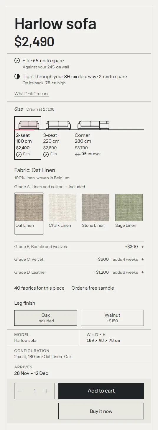
These go in the Product section's buy column, and in the Featured product section. In the Product section every block is a ruled field of one framed title block. The product templates already contain them, in this order: Product title, Rating, Price, Fit, Variant picker, Title block fields, Buy buttons, Price breakdown, Trust row, Pickup availability, Sticky add to cart.
Gallery #
The product media and the drawing that stands with the main photo. It's fixed in the Product section, so you can't remove or move it. The Product section's Drawing setting picks the drawing. See sections.
| Setting | What it does |
|---|---|
| Image shape | Landscape (4:3), Wide (3:2), Square, Portrait (4:5), or Original (no cropping), which keeps every image whole using the shape of the first image. |
| Show thumbnails on desktop | A thumbnail row. |
| Thumbnail position | Below the image, or Over the image. With Over the image, a product with more than 8 images shows arrows and a "1 / 12" counter instead. |
| Add the selected fabric's close-ups | From the fabric entry's Gallery field. |
| Match product images to fabrics by alt-text tag | For stores without fabric galleries. See photos per fabric. |
Shoppers can click an image to open a full-screen view with zoom. On phones the gallery swipes and shows a counter, and the drawing sits as a strip under the photo. Videos you upload, YouTube and Vimeo videos, and 3D models in the product's media play inside the gallery. A variant with its own image switches the main photo; otherwise the photo says what it shows ("Shown in Cream Bouclé").
Product details #
The details under the drawing: a heading, text and Detail row blocks. It's fixed in the Product section. Settings: Heading (default "The details") and Text, which the product templates leave empty. Write it only if it's true of every product on the template. See dimensions and details.
Product title #
| Setting | What it does |
|---|---|
| Size | Large, Medium or Small. |
On the product page the title is the page's main heading. In the Featured product section it links to the product page.
Rating #
Stars, the rating and the review count, from Shopify's review metafields, which review apps fill in. See reviews.
| Setting | What it does |
|---|---|
| Reviews link | Optional. Leave empty to link the count to the Reviews section on the page. |
Price #
| Setting | What it does |
|---|---|
| Show "From" price until a variant is chosen | Shows "From $2,490" when variant prices differ. |
| Show tax note | Shown when your prices include tax: "Taxes included." On by default, and on in every product template. |
| Show Shop Pay Installments message | Shown when Shop Pay Installments is available for the price. |
Sale prices show the compare-at price struck through. Unit prices show when the variant has one. On phones the fit line and the doorway line sit under the price, so they're in the first screen.
Fit #
The fit check for the selected size against the shopper's saved space: every line with what it measured against, the doorway line, the clearance for each drop on a pendant, "What "Fits" means" and your fit disclaimer. Set the clearance and the disclaimer in Theme settings > Your space and fit. See Your space and fit.
| Setting | What it does |
|---|---|
| Suggest other products | When a piece is too big and no size of it fits, link to a smaller one of the same kind from the product's first collection. |
Variant picker #
Option buttons, native swatches, the drawn sizes, and the fabric picker for options named in Theme settings > Fabrics and samples (such as Fabric or Finish) when the product lists its fabric entries. See fabrics.
| Setting | What it does |
|---|---|
| Fabric picker > Swatches per row | 4 to 8. The grid shows fewer when a swatch would be narrower than the longest word in a fabric's name, so names wrap between words only. |
| Swatches per grade | 3 to 12. How many swatches the open grade shows on the page. The other grades fold into one row each, with their surcharge and the weeks they add. |
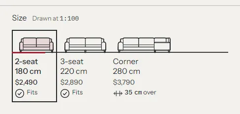
| Size options | Text; Each size against the shopper's wall, with its fit; The sizes side by side on one floor line; or Each footprint against the shopper's wall, from above. |
| Samples > Show sample buttons | Needs a sample product in Theme settings > Fabrics and samples. |
| Button label | Leave empty for "Order a sample", or "Order a free sample" when samples are free (Theme settings > Fabrics and samples > Samples are free, or a sample product priced at $0). Empty by default. |
The drawn Size options draw each size at one scale for the row, stated as "Drawn at 1:100" (1:150 on phones), with its price and a short fit state under it: "Fits", "Tight" or "35 cm over". They work only for an option whose values change the width; other options show text buttons. The sizes stay a group of radio buttons with text labels, so they work with a keyboard and screen readers.
Each option button shows its surcharge over the option's cheapest value, for example "+$150", and "Included" when there's none. A value that can't be chosen gives its reason instead of a price: "Not made in leather", "Not offered with Corner, 280 cm" or "Sold out". Products with one variant show no picker.
Title block fields #
Ruled fields for Model (the product title), Configuration (the selected options, such as "2-seater, 180 cm · Oat Linen · Oak"), W × D × H and Arrives (the arrival dates).
| Setting | What it does |
|---|---|
| Show the model | The Model field. |
Buy buttons #
Quantity, Add to cart and Shopify's accelerated checkout buttons. It also saves the lead time on the cart line, as set in Theme settings > Lead times. When the selected variant is sold out or unavailable, Add to cart is disabled and the accelerated checkout buttons are hidden. They come back when the shopper picks an available variant.
| Setting | What it does |
|---|---|
| Show quantity selector | Plus and minus buttons with a number field. Quantity rules from B2B catalogs are respected. |
| Show recipient form for gift cards | Lets customers send a gift card to someone else with a message and a send date. Shows on gift card products only. |
| Show dynamic checkout buttons | Shows Shopify's accelerated checkout buttons under Add to cart. On by default. The unbranded Buy it now button is an outline button, so Add to cart stays the main action; branded buttons, such as Shop Pay, keep their own colors. |
Add to cart is never narrower than Buy it now. On phones the quantity stepper has a row of its own, then Add to cart at full width, then Buy it now. On desktop the stepper stands beside Add to cart, and Buy it now lines up under Add to cart at the same width.
Price breakdown #
The selected configuration's price, itemized: the base price (the selected size with the cheapest choice of everything else), one row per upgrade with its surcharge (a velvet, a walnut leg), delivery and the total. The surcharges come from your variant prices, so they always add up. On desktop it folds to "Total $2,490 · See breakdown".
| Setting | What it does |
|---|---|
| Label for upgrades with no surcharge | Default "Included". |
| Delivery row | Default "Delivery". The product templates say "White-glove delivery" in the Treadle and Drawing Room styles and "Tracked delivery" in product.lighting. |
| Delivery price or note | Your delivery terms, for example "Included" or "Quoted at checkout". Empty by default. |
The delivery row shows only when both Delivery row and Delivery price or note are set. The product templates leave the price or note empty, so the row stays hidden until you write your terms.
Trust row #
Up to four short promises, such as returns, warranty, delivery and payment. An item without a heading is hidden, or links one of your store policies (see below).
| Setting | What it does |
|---|---|
| Style | Title-block table (labeled cells, no icons) or Icons. |
| Link store policies to empty items | While its heading is empty, the first item links your refund policy and the third your shipping policy, from Settings > Policies. On by default. |
| First item, Second item, Third item, Fourth item > Icon | For the Icons style: None, Returns, Warranty, Delivery, Payment, Time, Fabric, Handmade, Materials, Measure or Advice. |
| Field label | A short label over the promise in the table style. The defaults are Returns, Warranty, Delivery and Payment. |
| Heading, Text, Link | The promise. |
| Shop Pay Installments > Show Shop Pay Installments | The chosen item and Shopify's installments banner show only where your store offers Shop Pay Installments. On by default. |
| Under item | First item to Fourth item. The item the installments banner sits under. Default Fourth item. |
The returns, warranty and delivery items ship empty, because only you can state your terms. Until you write them:
- The first item shows your refund policy's title, linked to the policy (in the table style, under its Returns label). The third shows your shipping policy the same way. Each needs the policy to exist in Settings > Policies. Turn off Link store policies to empty items to hide them instead.
- The second item (Warranty) is hidden.
- The fourth item says "Pay over time" and "Split the cost with Shop Pay Installments." With Under item at Fourth item, it shows only where Shopify renders the Shop Pay Installments banner for the selected variant.
- A product page with none of these shows no trust row. In the theme editor, an empty row says what to write.
Write each item to your own return, warranty, delivery and payment terms. One trust row serves every product on its template, so keep the wording true of all of them, or use product.lighting for lights.
Lead time #
The arrival on a line of its own, for templates that don't use the title block fields: the base lead time (the variant's, else the product's) plus the weeks the selected fabric's grade adds, or the default lead time from Theme settings > Lead times. See lead times.
| Setting | What it does |
|---|---|
| Show estimated ship dates | Adds a date range counted from today. |
| Show the lead time note | Shows the lead time entry's Note. |
| Rule below | A hairline under the block. |
Room plan #
The selected size drawn from above in the shopper's room, from Your space > Room, or in an example room until they save theirs. Use it when the Product section's Drawing isn't already a room plan.
| Setting | What it does |
|---|---|
| Heading | Default "In your room". |
Pickup availability #
Shows whether the selected variant can be picked up at the nearest pickup location and the usual pickup time. A link opens a side panel with every location that offers pickup, its stock, address and pickup time. The block has no settings. Set up local pickup in Settings > Shipping and delivery. When no location offers pickup for the variant, the block shows nothing.
Dimensions #
A one-line summary from the product's width, depth and height metafields. Settings: Heading, Units (As entered, or Metric and imperial) and Text when the product has no dimensions. See dimensions and details.
Description #
| Setting | What it does |
|---|---|
| Collapsible row | Shows the description in a row the shopper can open. Off shows it as plain text. |
| Heading | The row title. Default "Details". |
| Open by default | The row starts open. |
The default product templates put the description in the Product details block instead. The product.simple template uses this block.
Sticky add to cart #
A bar with the selected variant's photo (or the fabric swatch), the title, the selected options, the fit line, the arrival, the price and an Add to cart button. It shows whenever the page's own Add to cart is off screen, from the moment the page loads. Its fit line is the riskier of the wall and doorway checks: the worse state, or of two equal states the one with less to spare. Needs a Buy buttons block in the same section.
| Setting | What it does |
|---|---|
| Show on desktop | At the bottom of the screen on large screens. |
| Show on mobile | One row on phones, edge to edge: price, fit line and arrival, button. |
| Show selected options | For example "3-seater, 220 cm · Forest Velvet · Oak". |
| Show lead time | The arrival dates. |
| Color scheme | The bar's colors. |
App blocks #
Apps that offer theme app blocks can be added to the Product section's buy column, the Reviews section, the Product details section, the footer, and the content sections listed at the top of this page. Choose Add block and look under Apps. Put a reviews app's block in the Reviews section.