Drawings
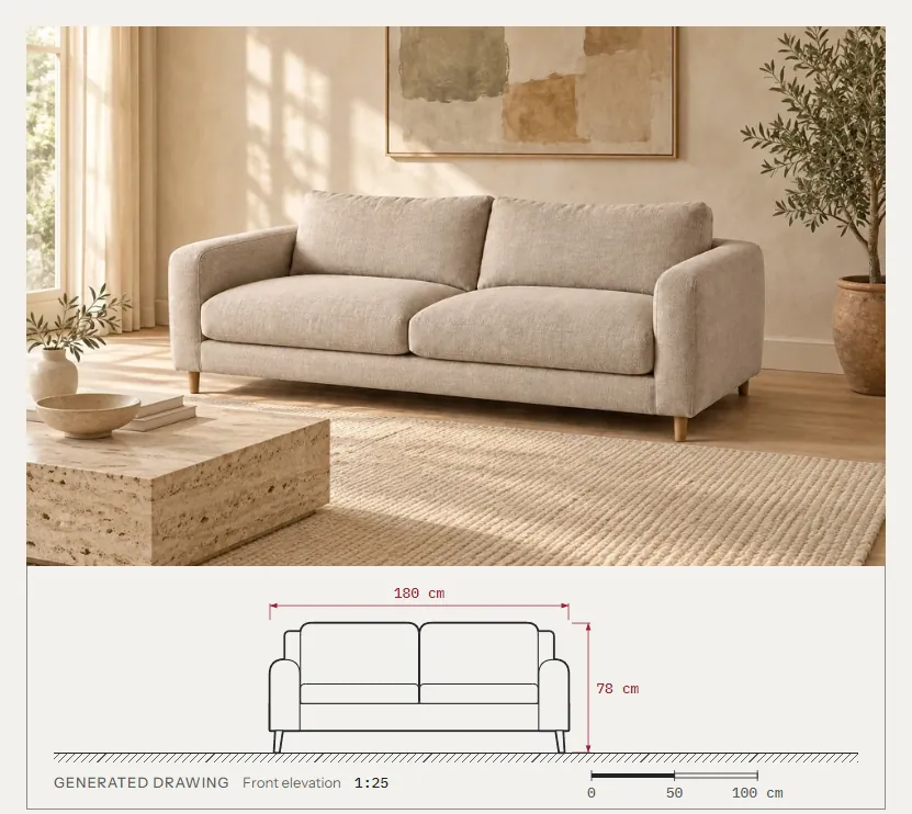
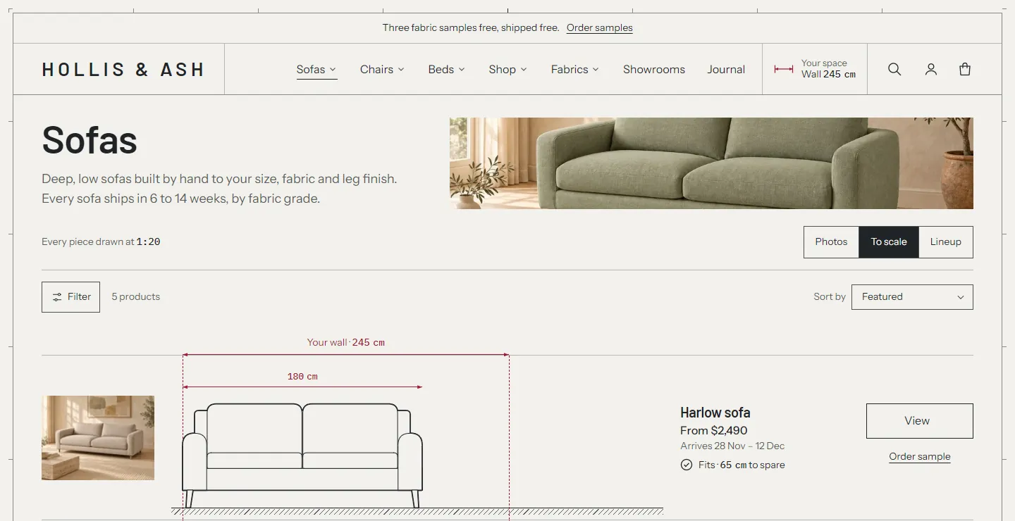
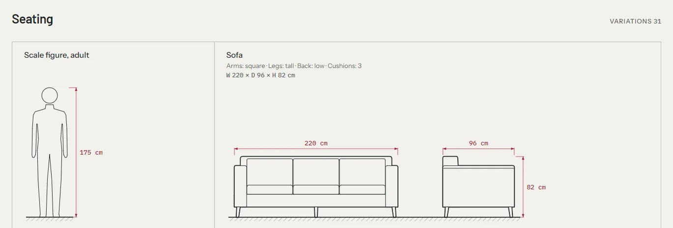
Treadle draws every product as a technical drawing at true scale: a front elevation, a side elevation and a plan from above. The drawings come from each product's dimensions and a few shape settings. They appear on the product page next to the photo, in collections, lineups, the cart, search and the homepage sections, all at stated scales such as "1:25".
You don't upload anything. Fill in the width, depth and height, pick a drawing type, and the theme draws the piece. The shape settings then adjust the arms, legs, back and cushions until the drawing looks like the photo.
What a drawing needs #
| Data | Where | Needed for |
|---|---|---|
| Width, depth and height | Product metafields custom.width, custom.depth, custom.height (type Dimension). Variants can have their own. | Every drawing and every fit check. Without width or height the piece shows "Made to size" instead of a drawing. Without depth the side view and plan are left out. |
| Drawing type | Product metafield custom.drawing_type | The silhouette. Without it the piece is drawn as a dimensioned box (the envelope). |
| Shape settings | Product metafields custom.arm_style, custom.leg_style, custom.back_style, custom.body_style, custom.cushions | The details of the silhouette. All optional. |
| Drop | Product or variant metafield custom.drop | Pendants only: the distance from the ceiling to the top of the shade. |
| Shades | Product metafield custom.shades (whole number, 1 to 12) | Linear pendants only: the number of shades on one bar. Optional. |
The exact definitions, with types and choices, are in the definitions reference. Create them once in Settings > Metafields and metaobjects, then fill them in on each product in the Metafields card.
Dimension values can be in millimeters, centimeters, meters, inches, feet or yards. The theme converts them to centimeters for drawing and shows them in the shopper's units.
Drawing types #
Pick one value for custom.drawing_type. The value is the key in the first column; the second column is what the theme calls it.
| Value | Draws | Fit check |
|---|---|---|
sofa | A sofa with arms, back and seat cushions | Width against the wall |
sectional | A corner sofa, an L with the return on the right | Width and depth against the room, and the width against the wall |
chaise | A chaise sofa | As a corner sofa |
armchair | An armchair, or a wingback with a high back and arms | None. Cards show W × D × H instead |
dining_chair | A dining chair | None |
stool | A stool, with a footring above 55 cm high | None |
ottoman | An ottoman or pouf | None |
bench | A bench | None. Cards show W × D × H instead |
bed | A bed with headboard, mattress, duvet and pillows | Height against the ceiling |
dining_table | A dining table | Width and depth against the room |
side_table | A side or coffee table | None |
sideboard | A sideboard with doors | Width against the wall |
shelf | Shelving with shelves about every 36 cm, in bays of up to 85 cm | Width against the wall, height against the ceiling |
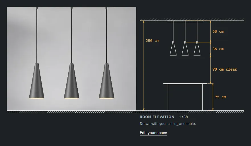
pendant | A pendant shade with its cord, canopy and ceiling line, or a bar of shades with custom.shades | Clearance above the shopper's table at each drop |
wall_light | A wall light in profile against its wall. Cards and lineups state its depth, how far it reaches from the wall | None |
table_lamp | A table lamp, standing on a drawn side table in room views | None |
floor_lamp | A floor lamp, or an arc lamp when the width is more than 0.55 × the height | None |
generic | A dashed box with diagonals, dimensioned (the envelope) | The doorway only |
See Your space and fit for what each fit check compares. Only sofas, corner sofas, chaises, sideboards and shelving are measured against the shopper's wall. Every piece also gets the doorway check, except lights and pieces under 60 cm on their smallest side. Types without a fit check show their doorway line in the cart, the sticky add to cart bar and the set schedules.
Sizes that change the shape #
A variant can override the product's type with its own custom.drawing_type. Use it when one size is a different body, such as the corner version of a sofa: the 2-seater and 3-seater variants draw as sofa, and the Corner variants set sectional.
A variant's own custom.width, custom.depth, custom.height and custom.drop win over the product's. You only need variant values for the measurements that change. The drawing, the fit lines and the title block's W × D × H redraw when the shopper picks another size.
Shape settings #
The shape settings are shared across types, so each one means something slightly different per type. Leave a setting empty to get the type's default. An empty arm style draws as square.
Arm style (custom.arm_style) #
On seating, tables and ottomans:
| Value | Sofas, corner sofas, chaises, armchairs | Tables, stools, ottomans, dining chairs |
|---|---|---|
square | Square arms | Tables, stools and side tables: a square or rectangular top. |
rounded | Rolled arms, with a scroll in the side view | Tables: a round or oval top. Ottomans: round. |
track | Track arms: a slab with a soft top, no scroll | Treated as square. |
flush | Low, thick arms (about 40% of the way from the seat to the top), fully rounded on top, in line with the base | Treated as square. |
none | Armless. On a curved sofa: a kidney sofa whose back wraps round into two rounded ends | Dining chairs: no armrests. |
dome | Treated as square. | Treated as square. |
On lamps, wall lights and beds the arm style picks the shade or the headboard:
| Value | Pendants | Table lamps | Floor lamps | Wall lights | Beds |
|---|---|---|---|---|---|
square | A drum, or a cylinder when the shade is at least 0.85 as tall as it is wide | A drum shade, drawn tapered as an empire shade | A drum shade | A cylinder | A plain panel headboard with sharp corners |
rounded | A dome, or a globe when the shade is at least 0.85 as tall as it is wide | A mushroom shade | A dome shade | A globe | A channel-tufted headboard with rounded corners |
none | A cone | A cone shade | A bowl uplight | An upward-opening cone | As square |
dome | As rounded | A drum shade | A drum shade | A dome opening downward, the light falling on the wall below it | As square |
track, flush | As rounded | A drum shade | A drum shade | A cylinder | As square |
dome is meant for wall lights. On any other type, pick one of the other values.
A rounded wall light that is wider and taller than it is deep is drawn as a plate sconce: in profile, the plate edge-on against the wall with the globe on it, reaching the light's depth; from the front, the globe inside the plate. For example, a light 23 cm wide, 13 cm deep and 23 cm high.
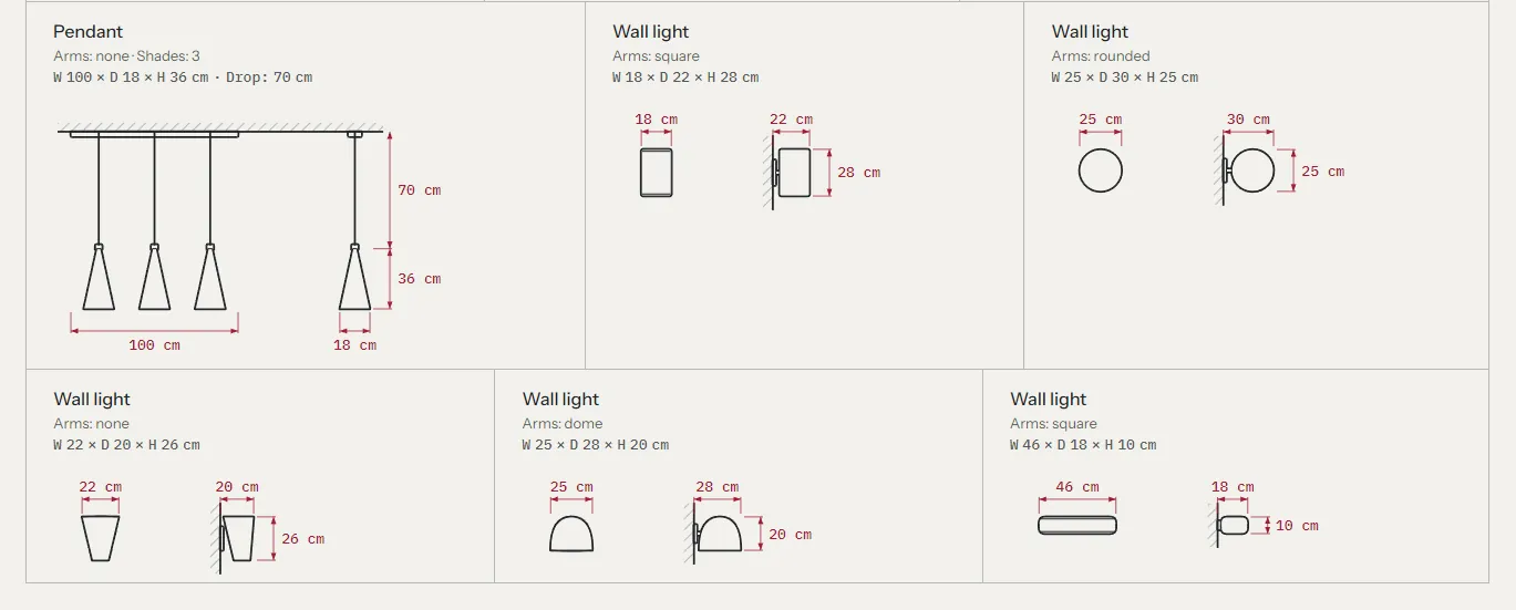
On a pendant the shade shape also follows its proportions. With custom.shades at 2 or more, the pendant is a bar of shades (see Shades). Otherwise, a shade at least 60 cm wide and less than 0.45 as deep as it is wide is drawn as a linear bar, and a shade less than 0.22 as tall as it is wide is a disc. An arc floor lamp (wider than 0.55 × its height) always has a dome shade.
Leg style (custom.leg_style) #
| Value | Upholstery | Tables, chairs and stools | Beds, benches, ottomans, storage |
|---|---|---|---|
tall | Tapered legs | Dining tables: four square legs with an apron. Chairs and stools: legs | Beds and ottomans on legs. Benches: a padded seat on legs with a stretcher. Sideboards on legs. |
short | Block or bun feet | Dining tables: four round legs. Side tables: a lower shelf | Benches: an upholstered block on block feet. |
plinth | A plinth base | A pedestal. Dining tables under 150 cm wide get one pedestal, wider ones a trestle. Chairs and stools get a tulip base | A recessed plinth. |
Long sofas get a center leg on their own.
Back style (custom.back_style) #
low: a tight back.high: loose back cushions. An armchair with arms and a high back is drawn as a wingback. A dining chair with a high back gets an upholstered back; a low back is two posts with a backrest.
Body style (custom.body_style) #
straight: the default.curved: a curved sofa or a tub chair, with a curved plan and a front view projected from it. Use it for kidney and crescent sofas and for barrel chairs.modular: separate rounded modules with a small gap, for modular sofas and corner sofas. The corner's return is drawn as a module seen end-on.
Cushions (custom.cushions) #
A number from 1 to 4. It sets the seat cushions on seating, the pillows on a bed (2 by default from 140 cm wide) and the doors on a sideboard (one per 45 cm by default). On a modular sofa it sets the modules along the main run.
Drop (custom.drop) #
For pendants: the distance from the ceiling to the top of the shade. Put it on each variant when the drop is an option (60, 80 and 100 cm, for example). Without a drop, the pendant is drawn with a short cord and a break mark, and the fit check can't work out the clearance.
Shades (custom.shades) #
For linear pendants: a whole number from 1 to 12. At 2 or more, the pendant is drawn as a bar canopy at the ceiling with that many shades hanging from it on their cords, evenly spaced. Leave it empty, or set 1, for a pendant with one shade.
For a linear pendant, measure it like this:
- Width: the length of the bar.
- Depth: one shade's diameter. Each shade is drawn as wide as the depth, and no wider than its share of the bar.
- Height: one shade's height, as for every pendant.
- Drop: from the ceiling to the tops of the shades.
The shades take their shape from the arm style: none draws cones, square (or empty) drums, rounded domes, or globes when a shade is at least 0.85 as tall as it is wide. Room plans draw the pendant from above as its bar and shades, not as one round shade. A three-light pendant 100 cm long, for example, has custom.shades = 3, a width of 100 cm and a depth of 25 cm.
How the scale works #
Each view has one scale, worked out from the largest piece in it and the space available. The scale is a standard ratio (1:20, 1:25, 1:40, 1:50 and so on) and it's true at 100% browser zoom: a 1:25 drawing of a 200 cm sofa is 8 cm long on screen.
- Every drawing in a view uses the same scale, so a 180 cm sofa is never drawn larger than a 220 cm one on the same page.
- Each product page layout has its own scale: about 1:25 for the drawing on the floor line, 1:40 for the room elevation and 1:50 for the room plan, and 1:60 on phones. Lighting pages draw at 1:30. A room that can't fit at the page's scale is drawn at the largest scale that fits.
- Theme settings > Drawing sheet > Largest drawing scale caps how large anything is drawn (1:10 by default).
- A generated scale bar (0, 50, 100 cm, for example) stands next to drawings, at the drawing's real length.
- The footer's title block states the scale of the page's main drawing, at the scale it's drawn. On a product page that's the drawing with the photo, so a wall light's room drawn at 1:40 on a 1:30 lighting page says 1:40. On home and collection pages it's the room plan when one is shown, else the Lineup hero or the scale the cards state. Any other page with several scales says "As drawn". Pages without drawings say "Not to scale".
Units #
Every measurement is shown in centimeters or inches. Theme settings > Drawing sheet > Default units sets the starting unit. Shoppers switch with the cm / in toggle in the footer and in the Your space panel, and their choice is remembered. Inches are rounded to the nearest half inch.
Labels and the text alternative #
Generated drawings carry the label "Generated drawing". Turn it off in Theme settings > Drawing sheet > Label generated drawings. Your own uploaded drawings are labelled "Drawing".
Every drawing has a text alternative for screen readers, for example "Front elevation and side elevation of Harlow sofa. 180 cm wide, 98 cm deep and 78 cm high, drawn at 1:25." The caption under the drawing repeats the dimensions as visible text.
Your own drawing (custom.drawing) #
If you have a real technical drawing, upload it as an SVG or an image to the product's custom.drawing metafield (type File). It replaces the generated drawing in the product page's full drawing.
The theme still uses the generated drawing everywhere it compares pieces at one scale: the drawing under the photo, room views, lineups, To scale rows, cards, the size picker and the cart. So keep the drawing type and the shape settings filled in, even with an upload.
Where drawings appear #
| Place | What's drawn | Set up in |
|---|---|---|
| Product page, first screen | The front elevation under the photo, a room elevation beside it, or a room plan beside it | Product section: Drawing |
| Product page, full drawing | Front, side and optionally plan, with dimensions and a scale bar | Product section: Full drawing views |
| Size picker | Each size drawn small, against the shopper's wall | Variant picker block: Size options |
| Collections | To scale rows, the Lineup view, drawn cards, plan cards, a room plan above the grid | Product grid section. See sections |
| Homepage | Lineup hero, Photo and drawing, Room elevation, Room plan, drawn collection cards, drawn rows | See sections |
| Complete the set, recommendations, recently viewed | The set in a room or on a floor line; drawings on cards | Each section's Layout or Card style |
| Testimonials | The piece a note is about, on a floor line or as a plan | Testimonials: Pieces on notes |
| Header menu | Drawn categories in mega menus | Header: Drawn categories in menus |
| Cart | A small drawing on each line, and the whole order drawn together | Theme settings > Cart |
| Search, 404, empty cart, password page | Drawings at one scale | Each section's settings |
The silhouette library #
The silhouette library is a page that draws every drawing type and shape variation at one scale: 24 seating variations with the adult figure, beds, tables and storage, lamps, pendants and wall lights, the plans, and the fallbacks. Use it to see what each setting draws before you fill in your products.
- In your admin, go to Online Store > Pages and click Add page.
- Title:
Silhouette library. Leave the content empty. - Under Theme template, choose drawing-library.
- Click Save, then View page.
Leave the page out of your menus. When you're done with it, set its Visibility to Hidden so shoppers can't find it.
In the theme editor, choose Pages > drawing-library to edit the Silhouette library section:
| Setting | What it does |
|---|---|
| Label above the heading, Heading, Text | The page's heading. |
| Scale on desktop | Automatic, or a fixed 1:15 to 1:30. |
| Scale on mobile | 1:30, 1:40 or 1:50. |
| Show plans | Adds the plan views. |
| Products to draw from their metafields | Your own products, drawn after the library from their dimensions and shape settings. |
| Product with an uploaded drawing | A product whose custom.drawing has a file, to show the uploaded-drawing fallback. |
The group of your own products shows only when you pick products. Until you pick them, the theme editor says what to choose; the live page shows neither the group nor the prompts.
The library and the Shape check page draw a lot of SVG, so they're slower than a normal page. Keep them hidden from shoppers.
Type specimen #
The specimen page template shows the active style's fonts, type scale, colors with their contrast ratios, line weights, price styles, fit states, the space chip and a product's swatches and drawing. It's a design check for your colors and fonts. Create it the same way, with the template specimen. In the Type specimen section, set the Label above the heading, Heading and Sample heading (a line set in every heading size), pick a Product for the price, swatches and drawing, and optionally a Drawing type override to draw it as another type.
Drawing sheet settings #
The page frame and the drawing style are in Theme settings > Drawing sheet. See theme settings.
Troubleshooting #
- A product page has no full drawing, or a To scale row says "Dimensions on request". The product has no width or height. In the theme editor, its page says so where the drawing would be. Check the keys (
custom.width, notcustom.product_width) and that the type is Dimension, not text. - A product is drawn as a dashed box. It has no
custom.drawing_type, or the value isn't one of the types above. - The drawing has no side view or plan. The product has no depth.
- The corner size draws as a straight sofa. Give the corner variants
custom.drawing_type=sectional. - A pendant hangs from a short cord with a break mark. It has no
custom.drop. Set the drop on the product or on each drop variant. - A pendant with several shades draws as one bar or one wide shade. Set
custom.shadesto its number of shades, the width to the bar's length and the depth to one shade's diameter. - A wall light with a downward shade draws as an upward cone or a cylinder. Set its arm style to
dome. If the choice is missing, adddometo the Arm style definition's choices. - The drawing doesn't change with the size. The size variants have no width of their own, or the variant definitions are missing. See dimensions per size.
- My uploaded drawing doesn't show in the collection. That's expected. Uploads replace the product page's full drawing only.