Styles
Treadle comes in three styles. Treadle is the default style, the one the theme installs with when no other is chosen. They share every section, block and made-to-order feature, and every page is laid out as a drawing sheet. They differ in colors, fonts, the drawing each page leads with, and how collections, sets and the cart are drawn.
| Style | Look | Leads with | Good for |
|---|---|---|---|
| Treadle | Drafting paper, graphite ink, crimson dimensions. Barlow headings | The whole collection drawn to scale on one floor line, next to a person | Upholstery: sofas, beds, chairs |
| Graphite | Dark graphite, off-white lines, amber dimensions. IBM Plex Sans Condensed headings | A section through the shopper's room, floor to ceiling, with each pendant at its drop | Lighting, and furniture sold on its measurements |
| Drawing Room | Warm cream, aubergine ink, bronze dimensions. Cormorant headings | The room plan from above, with the pieces placed in one room | Upholstery and furnished rooms, sold on the room |
All three set measurements in IBM Plex Mono, and use it for measurements only, never for prices or text.
Treadle #
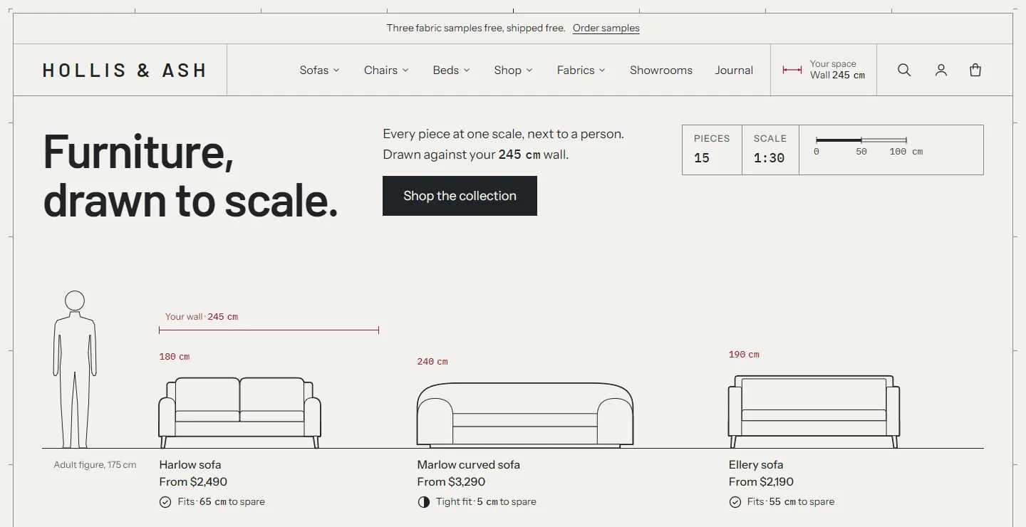
Colors. Paper #F2F1EC, graphite text #212427, crimson dimension lines #A21F35. Color scheme 4 is the same page with a warm terracotta dimension color (#9C4F28). Pick it as the Page color scheme if crimson doesn't suit your brand.
Fonts. Headings in Barlow SemiBold, body in Instrument Sans, measurements in IBM Plex Mono Medium. Small headings and buttons use the body font.
Pages.
- Home: the Lineup hero (the collection at one scale with the figure and the shopper's wall), two Photo and drawing features, a collection list with drawn categories, the fabric strip, the workshop (image with text) and testimonials as numbered notes, which draw each note's piece once you pick one.
- Product: the front elevation stands on a floor line directly under the photo. The full drawing shows the front, side and plan. Sizes are drawn side by side on one floor line. Complete the set is a lineup with the shopper's wall. Recommendations show each photo with its drawing.
- Collection: opens in the To scale view, one row per piece, with the shopper's wall as a bracket through the rows.
- Cart: the order drawn on one floor line against the shopper's wall.
Graphite #
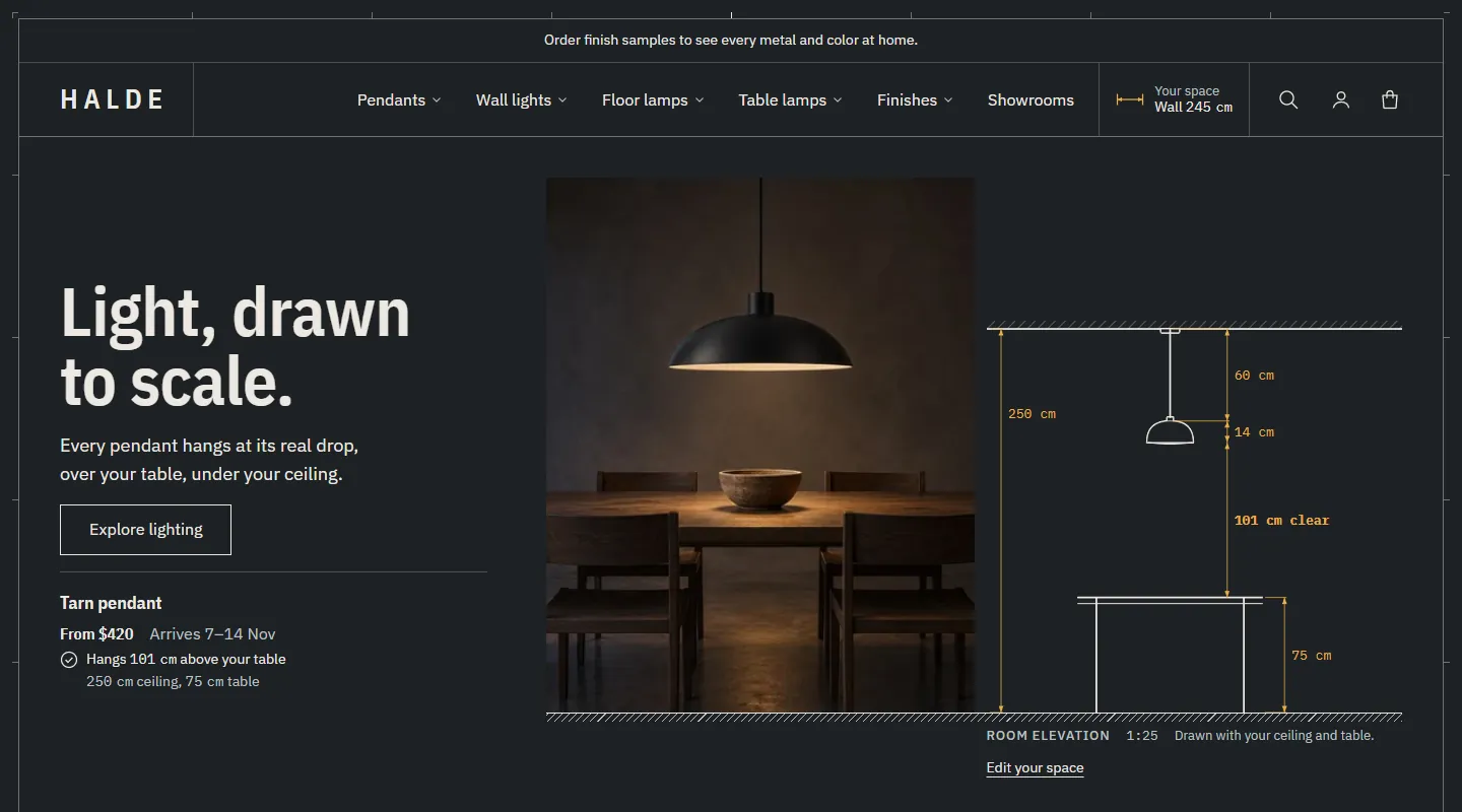
Colors. Graphite #1E2124, off-white text #ECE9E2, amber dimension lines #E9AE48. Color scheme 2 is the light reverse, for a band of contrast. Scheme 4 has a pale blue dimension color.
Fonts. Headings in IBM Plex Sans Condensed SemiBold, body in IBM Plex Sans, measurements in IBM Plex Mono. Buttons use the heading font.
Pages.
- Home: the Room elevation hero (a photo beside a section through the room), a room lineup with every light hung from one ceiling line, a drawn row of furniture standing in one room, drawn categories, the workshop and numbered notes.
- Product: a room elevation beside the photo, on one floor line: a sofa against the shopper's wall with the space each side, or a pendant over the table with its clearance. Each size is drawn against the shopper's wall with its fit. Complete the set stands in one room elevation, with a schedule of each piece's size, price and fit. Recommendations are drawn cards.
- Collection: drawn cards, where the front elevation leads and the photo is a small inset. The filters open in a drawer.
- Cart: the order in one room elevation, each pendant at its drop. The drawer heading shows the item count as a title-block field.
Drawing Room #
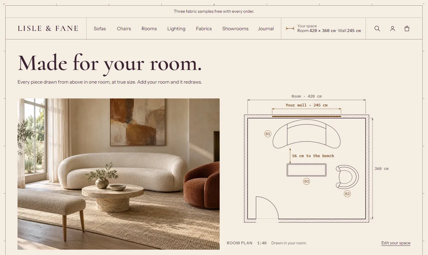
Colors. Warm cream #F5EEE3, aubergine text #3A2232, bronze dimension lines #7B4E1F. Corners have a 2 px radius.
Fonts. Headings in Cormorant SemiBold at a larger size scale, body in Instrument Sans, measurements in IBM Plex Mono Medium. Cormorant is used at 20 px and up only: small headings and prices use the body font, because Cormorant's figures are old-style.
Pages.
- Home: the Room plan section leads, the room photo beside a plan of the pieces in one room, numbered, with a schedule. Then sofa cards with each piece's footprint, room plan tiles for each category, the fabric strip, the workshop, numbered notes with plans, and the showroom.
- Product: the photo and the room plan side by side, half and half, with the buy box under them. Sizes are drawn as footprints against the shopper's wall. Complete the set is placed in the shopper's room plan with a numbered schedule. Recommendations show each photo with its plan.
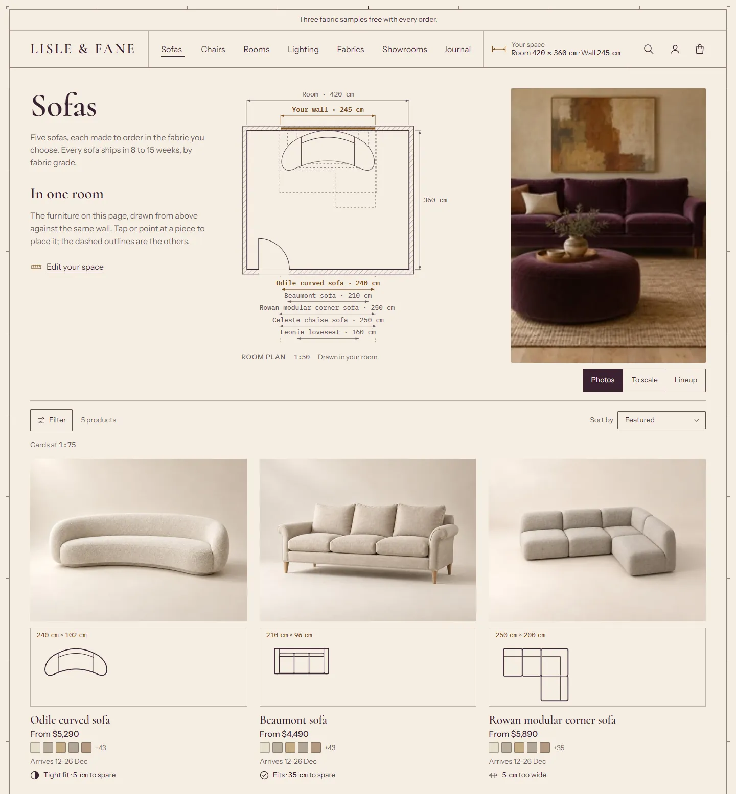
- Collection: the page opens with one room plan comparing the footprints of the pieces on the page, the collection's title and image beside it. Pointing at a card places its piece in the plan. The cards are photos with their footprints.
- Cart: the order placed in the shopper's room plan. The drawer heading is set in Cormorant over a ruled line. The header chip shows the room first.
Choose a style when you install #
Pick the style at the top of Treadle's listing in the Shopify Theme Store before you click Try theme. Without a choice you get the Treadle style, the default. Each style installs its own settings and its own page templates (home, product, the lighting product template, collection, cart, search, the list of collections, contact, the fabric library and the password page).
Switch styles later #
In the theme editor, open Theme settings (the paintbrush icon) and choose a style under Theme style. This changes the settings on the theme settings page: colors, fonts, buttons, spacing, the cart drawing and the chip. It doesn't change your page layouts, because those live in your templates.
To get another style's page layouts, add that style from the Theme Store as a second copy of the theme, or rebuild the pages in the editor with the settings below.
Settings each style changes #
Theme settings:
| Setting | Treadle | Graphite | Drawing Room |
|---|---|---|---|
| Headings font | Barlow SemiBold | IBM Plex Sans Condensed SemiBold | Cormorant SemiBold |
| Body font | Instrument Sans | IBM Plex Sans | Instrument Sans |
| Measurements font | IBM Plex Mono Medium | IBM Plex Mono | IBM Plex Mono Medium |
| Use the body font for small headings | On | Off | On |
| Price font | Heading | Heading | Body |
| Heading size scale | 100% | 100% | 115% |
| Primary button font | Body | Heading | Body |
| Corner radius (images, inputs, swatches, buttons) | 0 px | 0 px | 2 px |
| Space between sections | 80 px | 72 px | 88 px |
| Cart > Your order, drawn | On one floor line | In one room elevation | In the shopper's room plan |
| Cart > Drawer heading | Plain | Sheet count | Heading face over a ruled line |
| Your space and fit > Header chip shows | Wall | Wall | Room |
Template settings:
| Where | Setting | Treadle | Graphite | Drawing Room |
|---|---|---|---|---|
| Product section | Drawing | Drawing on the floor line | Room elevation | Room plan |
| Product section | Full drawing views | Front, side and plan | Front and side | Front and side |
| Product section | Gallery width on desktop | Large | Extra large | Across the page |
| Variant picker | Size options | Side by side on one floor line | Each size against the wall | Each footprint against the wall |
| Complete the set | Layout | Lineup | Room elevation | Room plan |
| Recommendations, Recently viewed | Card style | Photo with its drawing | Drawing first | Photo with its plan |
| Product grid | Default view | To scale | Photos | Photos |
| Product grid | Cards in the photo view | Photo | Drawn | Photo and plan |
| Product grid | Room plan above the photos | Off | Off | On, leading the page |
| Search results | Drawings on the cards | Front, on a floor line | Front, on a floor line | Plan footprint |
Everything else, such as the fabric settings, lead times, the clearance and the sample limit (3 in every style), is the same in all three.