Templates
A template is the layout for one type of page. Every product page uses a product template, every collection page a collection template, and so on. Treadle comes with the templates below. In the theme editor, switch between them with the page menu at the top.
Each style installs its own versions of the home, product, lighting product, collection, cart, search, list of collections, contact, fabric library and password templates. This page describes what each contains, and where the styles differ. See styles for the details.
Assign an alternate template #
Some templates are alternates, for example product.simple, product.lighting or page.fabric-library. To use one:
- Open the product or page in your admin.
- In the Theme template box, choose the template, for example simple or fabric-library.
- Click Save.
To make your own alternate, open the page menu in the theme editor, choose for example Products, then Create template. Base it on an existing template and give it a name.
Product templates #
product (default) #
For products with options, such as a sofa in three sizes, 40 fabrics and two leg finishes.
- Product: the gallery with its drawing, the full drawing and the details under it, and the buy column as a title block: Product title, Rating, Price, Fit, Variant picker, Title block fields, Buy buttons, Price breakdown, Trust row, Pickup availability and Sticky add to cart.
- Reviews: a holder for your reviews app's block. Hidden until you add one. See reviews.
- Complete the set: the product's group. See complete the set.
- Recommendations.
- Recently viewed.
| Style | Drawing with the photo | Full drawing | Sizes | Complete the set | Cards below |
|---|---|---|---|---|---|
| Treadle | On the floor line, under the photo | Front, side and plan | On one floor line | Lineup | Photo with its drawing |
| Graphite | Room elevation beside the photo | Front and side | Each against the wall | Room elevation | Drawing first |
| Drawing Room | Room plan beside the photo, half and half, the buy box under them | Front and side | Footprints against the wall | Room plan | Photo with its plan |
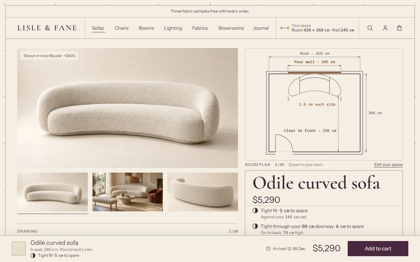
One product template serves every product, so its trust row, delivery row and detail rows say the same thing on every product. The templates ship without terms: the trust row links your refund and shipping policies until you write its items, the Price breakdown's delivery row stays hidden until you give it a price or note, and the details text and the delivery row's text are empty, so the delivery row shows only the arrival dates. Write them to your own terms before you launch. See Trust row and the details.
If you sell lighting next to furniture, assign your lights to product.lighting, so you can write their terms separately.
product.lighting #
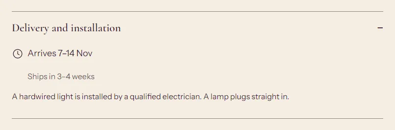
The style's product template, with wording for lights instead of furniture. Each style has one, with the same sections and layout as its default product template. Only the wording differs:
| Where | product (default) | product.lighting |
|---|---|---|
| Price breakdown, Delivery row | "White-glove delivery" (Treadle, Drawing Room) or "Delivery" (Graphite), hidden until you set Delivery price or note | "Tracked delivery", hidden the same way |
| Detail rows | Materials and care; Delivery and assembly (Graphite: Delivery), showing the arrival dates | Finish and care; Delivery and installation: the arrival dates and "A hardwired light is installed by a qualified electrician. A lamp plugs straight in." |
The trust row and the details text are empty in both.
When to use it:
- A furniture store that also sells lamps. Assign every pendant, wall light, table lamp and floor lamp to lighting, so their rows say Finish and care and Delivery and installation, and their trust row and delivery terms can differ from the furniture's.
- A store that sells only lighting. Change the default template's wording to your terms, or assign every product to lighting.
To assign it, open the product, choose lighting in the Theme template box and click Save. Edit the wording in the theme editor: open the page menu, choose Products > lighting, and change the Price breakdown, Trust row and Product details blocks. Write the returns, warranty and delivery wording to your own terms.
product.simple #
For products without options, such as a cushion or a single-size stool.
- Product: a half-width gallery with the drawing on the floor line, Product title, Price, Lead time, Description (shown inline), Variant picker, Buy buttons, Pickup availability, Dimensions and Sticky add to cart.
- Product details: two rows, Materials and care, and Delivery and returns.
- Recommendations and Recently viewed.
A product with dimensions is drawn on this template too. For a piece with sizes or fabrics, use the default template.
Collection and search #
collection #
Collection banner (title, description, image) and Product grid (the Photos, To scale and Lineup views, filters, sorting, pagination). Set up filters in the Search and Discovery app. See sections.
| Style | Opens in | Photo view cards | Above the products |
|---|---|---|---|
| Treadle | To scale | Photo | The banner, with the collection image beside the title in the Band shape |
| Graphite | Photos | Drawn: the elevation leads, the photo as an inset | The banner, with the collection image beside the title in the Band shape |
| Drawing Room | Photos | Photo and plan | One room plan comparing the pieces, with the collection's title and image beside it (no banner) |
list-collections #
The page at /collections: Collections list, with tiles for your collections. Treadle and Graphite show each tile's photo with its piece drawn under it; Drawing Room shows photos only.
search #
Search results: a search field, filters, sorting and results. Products are drawn at one scale under their photos (as plan footprints in Drawing Room). Pages and blog posts show as text cards.
Pages #
page #
Page: the page title and content, with the title in a ruled column beside the text, and an optional image.
page.contact #
Page (your intro text), then Contact form with text and a location on one side and the form on the other. Assign it to your contact page. The text reads "Questions about a piece, its fabrics or its delivery? Send us a message and we'll get back to you." The location, "Visit us", stays hidden until you give it an address, opening hours or a directions link.
page.fabric-library #
Fabric library: every fabric, grouped by grade, with search, filters and samples. See fabric library page.
page.shape-qa #
Shape check: each product's photo beside its generated drawing and shape settings. For you, not for shoppers. See Shape check.
page.drawing-library #
Silhouette library: every drawing type and shape variation at one scale. See the silhouette library.
page.specimen #
Type specimen: the active style's fonts, colors with their contrast ratios, line weights, prices, fit states and a product's drawing. See type specimen.
Cart #
cart #
Cart (product lines with their drawings and fit, samples, the order drawing, the notes, totals, order note, checkout) and Recently viewed. The cart drawer is separate and appears on every page when Theme settings > Cart > Cart type is set to Cart drawer. How the order is drawn is set in Theme settings > Cart > Your order, drawn.
Blog #
blog #
Blog posts: tag links, the newest post as a large feature, then a numbered grid.
article #
Blog post: the article with a ruled row for the date, author, reading time and tag, then comments and more posts.
Home page #
index #
Each style has its own home page. You can add, remove and reorder every section.
| Style | Sections |
|---|---|
| Treadle | Lineup hero (the collection at 1:25 with the figure and the wall), two Photo and drawing features, Collection list with drawings, Fabric strip, Image with text, Testimonials as numbered notes |
| Graphite | Room elevation hero, Lineup hero as a room section (the lights at their drops), Featured collection as a drawn row in one room, Collection list with drawings, Image with text, Testimonials as numbered notes |
| Drawing Room | Room plan, Featured collection with plans, Collection list with room plan tiles, Fabric strip, Image with text, Testimonials with plans, Showroom |
The newsletter signup is in the footer on every style. See sections for the drawing sections.
The home pages' wording is an example for you to replace. The brand story in Image with text says the pieces are made to order, and Drawing Room's Showroom section describes a showroom. Rewrite or remove them if that isn't how your store works. The Testimonials notes, headed "Before you order", give measuring advice and name no customer. Every button that leads to all products says "Shop all".
Other templates #
| Template | Contents |
|---|---|
| 404 | Page not found: "This page didn't fit through the door.", a doorway drawn at true scale with the figure, search and links. |
| password | Password page: shown while the store is password protected, with your collection drawn to scale. |
| gift_card | The gift card page shoppers open from their email, drawn as a dimensioned card: balance, code with a copy button, expiry date, QR code, print and Apple Wallet buttons. It has no editor settings and follows your colors and fonts. |
Customer accounts use Shopify's new customer accounts, so Treadle has no account templates. The header shows the account button and its pop-up menu.
Header and footer #
The header and footer are section groups shared by every page. The header group holds Announcement bar and Header. The footer group holds Footer, which ends in the drawing sheet's title block. Rich text, Newsletter and Multicolumn can also go in the footer group, above the footer.